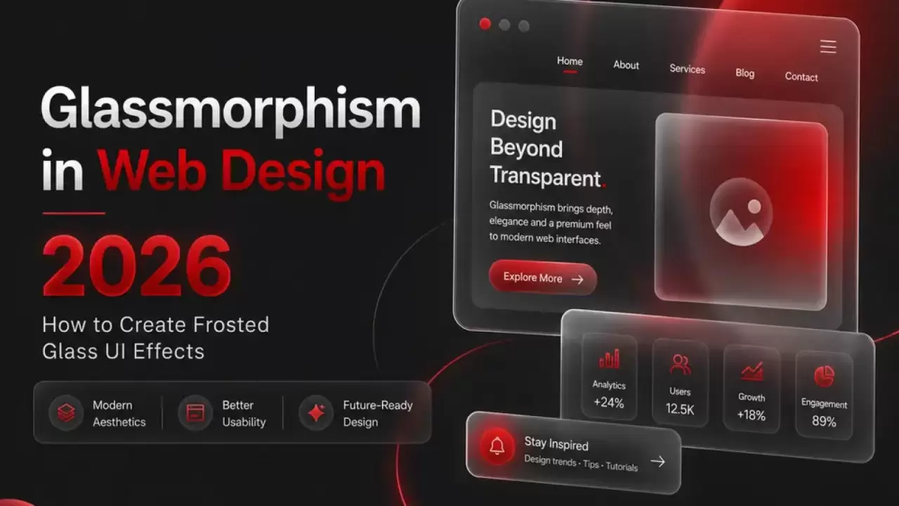
Learn glassmorphism design in 2026: frosted glass effects, CSS code examples, trends, best practices & accessibility tips for modern websites and apps. Create stunning UI with blur & transparency.
Glassmorphism is a popular UI design trend that creates the illusion of frosted or semi-transparent glass elements floating over vibrant or complex backgrounds. It adds depth, layering, and a premium, futuristic feel to interfaces without making them feel heavy or cluttered.
It first exploded around 2020–2021 (popularized by designers like Michal Malewicz who coined the term), faded during the ultra-minimalist phase, and made a strong, more mature comeback in 2025–2026 — especially with influences from Apple's Liquid Glass system, spatial computing (like Vision Pro), and modern web/app dashboards.
Core Characteristics of Glassmorphism
- Transparency (semi-see-through background)
- Backdrop blur (frosted glass effect that blurs what's behind)
- Subtle border (usually a thin, light outline)
- Light shadows or highlights (to suggest edge lighting/refraction)
- Layered feel — elements appear to float in depth
It strikes a balance between flat design (simple & clean) and skeuomorphic/3D realism (tactile depth).
Visual Examples
Here are some classic glassmorphism UI examples to help visualize it:
(These show cards, modals, and sections with the typical frosted overlay on colorful/gradient backgrounds.)
How to Create Glassmorphism in CSS (2026 Best Practices)
The magic mostly comes from two properties: backdrop-filter and semi-transparent backgrounds.
.glass-card {
/* Core glass effect */
background: rgba(255, 255, 255, 0.1); /* or rgba(18, 18, 18, 0.15) for dark mode */
backdrop-filter: blur(12px); /* 8–20px is sweet spot */
-webkit-backdrop-filter: blur(12px); /* Safari support */
/* Border for definition */
border: 1px solid rgba(255, 255, 255, 0.18); /* subtle white edge */
border-radius: 16px; /* softer corners = more glass-like */
/* Optional depth & realism */
box-shadow: 0 8px 32px rgba(0, 0, 0, 0.15);
/* Text readability safeguard */
color: #ffffff;
text-shadow: 0 1px 2px rgba(0, 0, 0, 0.4);
}


Important background setup (never apply blur to the body itself):
body {
background: linear-gradient(135deg, #667eea, #764ba2); /* vibrant gradient */
min-height: 100vh;
/* Fallback solid color in case image fails */
background-color: #1a1a2e;
}
2026 Best Practices & Tips
- Use sparingly — hero sections, cards, modals, sidebars, nav bars. Avoid blanketing the entire UI.
- Ensure readability — always place dark text on light glass or vice versa. Add subtle text-shadow or increase contrast dynamically.
- Accessibility first — Test with high-contrast mode. WCAG recommends minimum 4.5:1 contrast ratio. Dynamic contrast adjustment (via JS or media queries) is trending.
- Performance — backdrop-filter is GPU-accelerated but can be heavy on low-end mobile. Limit blur radius and number of glassy elements.
- Dark mode adaptation — Use darker semi-transparent backgrounds (e.g., rgba(30, 30, 46, 0.25)) + lighter borders.
- Combine with trends — Pair with micro-animations, liquid motion, organic shapes, or subtle 3D transforms for 2026 polish.
- Browser support — Excellent in 2026 (Chrome, Safari, Edge full; Firefox needs flag or fallback opacity).
When to Use Glassmorphism
- Premium/fintech dashboards
- Creative portfolios & agencies
- Mobile app onboarding / modals
- AR/VR/spatial interfaces
- Luxury brand websites
Avoid it for: content-heavy blogs, data tables (poor readability), or accessibility-critical apps unless heavily adapted.
Glassmorphism gives that "expensive, modern, immersive" vibe with surprisingly little code. Want a ready-to-copy code snippet for a full glass card + hover effect, or tips on implementing it in Webflow/Framer/Elementor? Let me know!
FAQs – Glassmorphism in Web Design 2026
Q1. What is Glassmorphism in web design?
Glassmorphism is a UI design style that uses transparency, blur, and subtle borders to create a frosted glass effect.
Q2. Why is Glassmorphism popular in 2026?
Glassmorphism creates modern, premium-looking interfaces inspired by spatial computing and advanced operating systems.
Q3. How does Glassmorphism work?
Glassmorphism combines semi-transparent backgrounds, backdrop blur, soft shadows, and thin borders to simulate glass.
Q4. What CSS property creates the Glassmorphism effect?
The backdrop-filter: blur() property is the primary CSS feature used to create Glassmorphism.
Q5. What is the ideal blur value for Glassmorphism?
A blur value between 8px and 20px typically provides the best frosted glass effect.
Q6. Is Glassmorphism good for user experience?
Yes, when used correctly, Glassmorphism improves visual hierarchy and creates a modern user experience.
Q7. Is Glassmorphism mobile-friendly?
Yes, Glassmorphism works on mobile devices, but excessive blur effects can impact performance on low-end devices.
Q8. Does Glassmorphism affect website performance?
Heavy use of backdrop blur can increase GPU usage, so designers should limit the number of glass elements.
Q9. Is Glassmorphism accessible?
Yes, if text contrast meets WCAG accessibility standards and content remains easy to read.
Q10. What colors work best with Glassmorphism?
Gradient backgrounds, vibrant colors, dark mode themes, and soft pastel shades work best with Glassmorphism.
Q11. Can Glassmorphism be used in dark mode?
Yes, Glassmorphism works exceptionally well in dark mode using darker transparent backgrounds and light borders.
Q12. What is the difference between Glassmorphism and Neumorphism?
Glassmorphism uses transparency and blur, while Neumorphism relies on soft shadows and raised surfaces.
Q13. Where should Glassmorphism be used?
Glassmorphism is ideal for cards, modals, dashboards, navigation bars, login forms, and hero sections.
Q14. When should you avoid Glassmorphism?
Avoid Glassmorphism for data-heavy tables, content-focused blogs, and accessibility-critical applications.
Q15. Is Glassmorphism SEO-friendly?
Yes, Glassmorphism does not affect SEO directly as long as page speed, accessibility, and content quality are maintained.
Q16. Which industries benefit most from Glassmorphism?
Fintech, SaaS, luxury brands, creative agencies, AI products, and mobile apps commonly use Glassmorphism.
Q17. Does Glassmorphism work in all browsers?
Most modern browsers support Glassmorphism, including Chrome, Edge, Safari, and recent Firefox versions.
Q18. What are the key elements of Glassmorphism?
The main elements are transparency, backdrop blur, subtle borders, soft shadows, and layered depth.
Q19. Can Glassmorphism improve website conversions?
When used strategically, Glassmorphism can enhance visual appeal and increase user engagement.
Q20. What are the latest Glassmorphism trends in 2026?
Popular trends include Liquid Glass UI, micro-interactions, 3D effects, spatial design, and AI-powered adaptive interfaces.
Q21. How do you create a Glassmorphism effect in CSS?
Create a semi-transparent background, apply backdrop-filter: blur(), add a subtle border, and use soft shadows for depth.